How to Create a Squarespace Pop Up
Adding a pop up to your Squarespace website is one of the awesome capabilities that I love about using the platform. And Squarespace makes it super easy to do so.
A pop up can be used for many different purposes, including:
As an opt-in form for visitors to subscribe
As an opt-in form for visitors to get a free download/lead magnet
As an opt-in form for visitors to get a discount, like 10% off digital products
To promote an event or a new service
Squarespace pop ups are simple in nature, which follows suit with Squarespace as a whole. There isn’t a whole lot of customization, which is why a lot of the templates are clean and don’t allow a lot of text.
In this post, I’m breaking down the 8 steps to creating a Squarespace pop up.
1. Before you start - pop up best practices
Keep it simple. Basically, you don’t have much of a choice because Squarespace created these with that intention.
You only have room for an image, heading, paragraph, and a subscribe area or call to action button. Keep these areas concise. The least amount of info, the better. You want the pop up to grab your site visitors’ attention, but not overwhelm them.
If you want to lead people to a page with more information, it’s very easy to do that with a button. I will discuss that later.
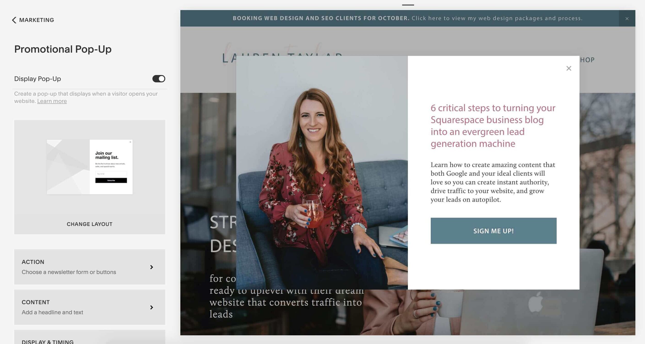
2. Go to Marketing - Promotional Pop Up
This will bring you to the panel where you will create and design your pop up.
A pop up will automatically appear. You can leave “display pop-up” unchecked until you have finalized the design and it’s ready to go.
The edits will appear on the right side of your screen as you change the settings in this panel.
Below, I’ve included an example of what mine looks like.
3. Choose a layout
You’ll see the default option appear on the screen. You can click on “change layout” to view more layouts and choose the one that works best for your needs.
There’s 9 total layouts you can choose from.
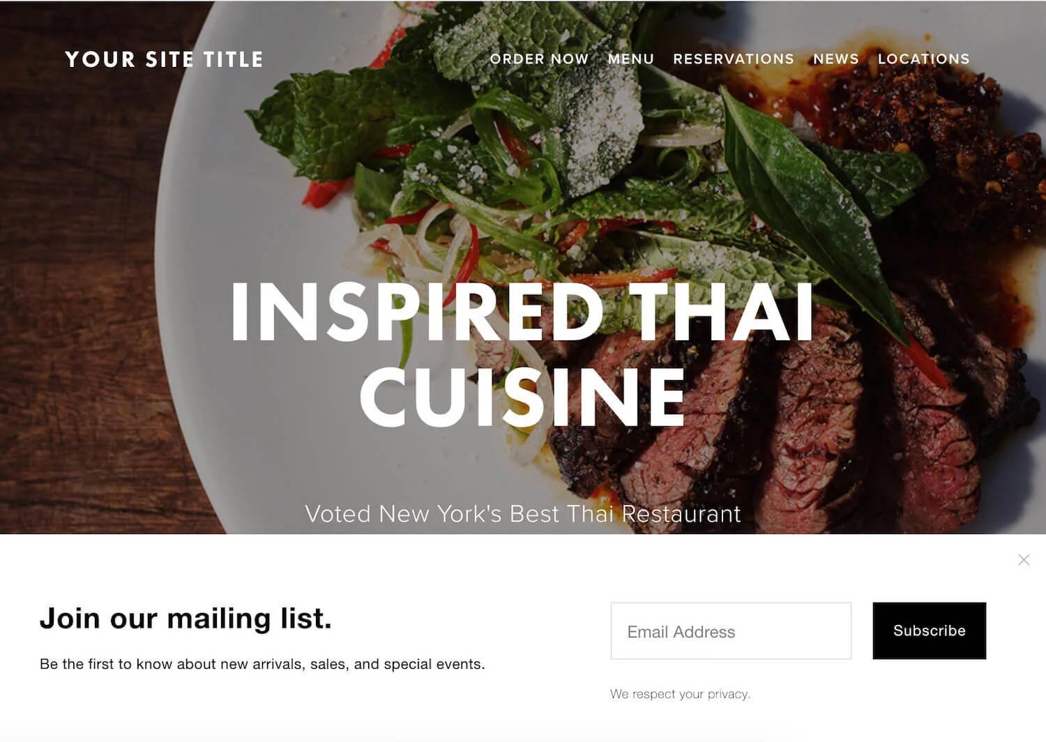
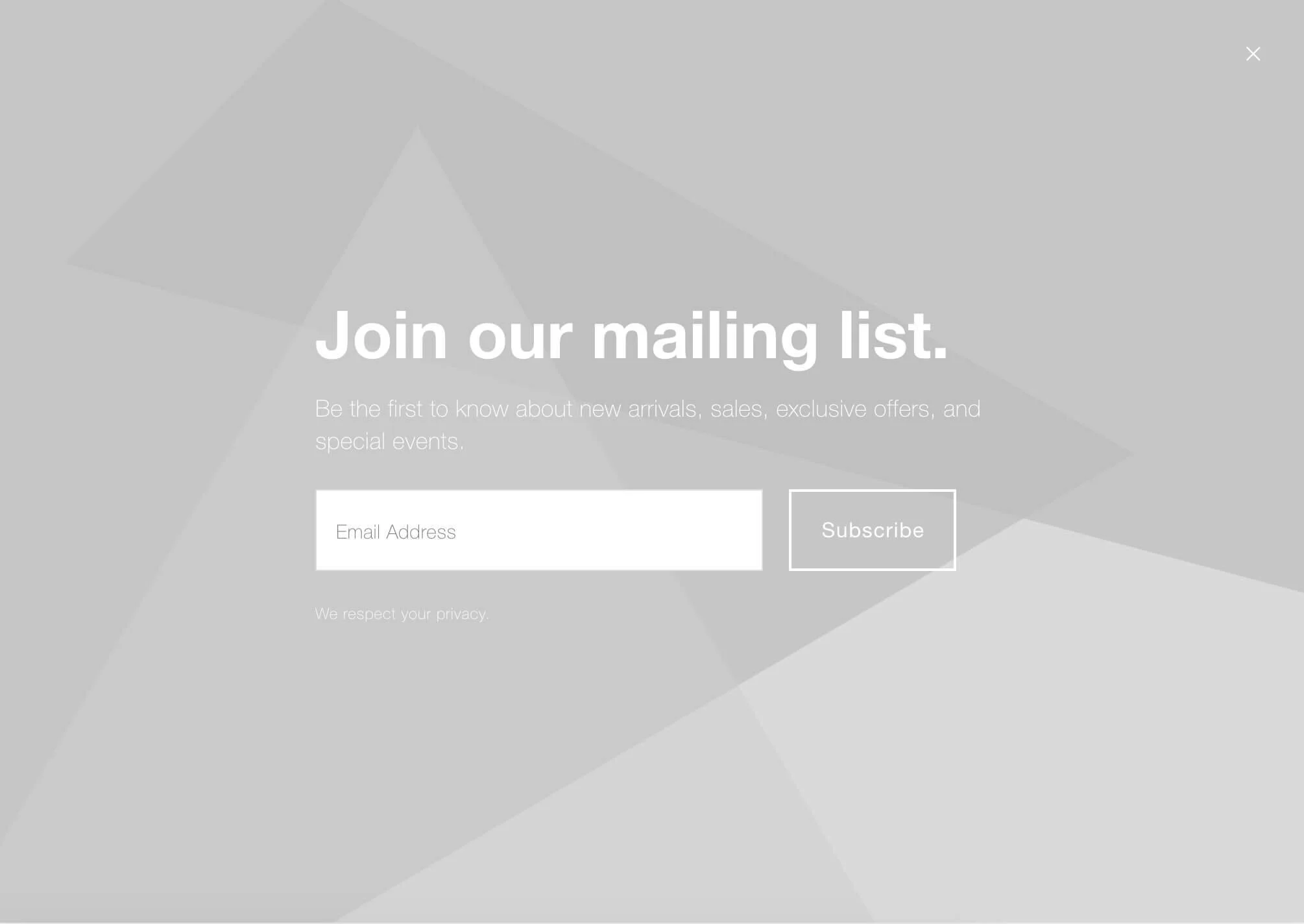
As you can see from the options below, you can choose between including a photo and not (the geometrical pattern suggests that is where a photo would go). There’s also options of placement - middle, bottom, and in the corner of the screen. You can see how those would appear on a website in terms of how much space it takes up.
Then there are 2 full screen options. Personally, I don’t like these because I find them to be intrusive and more difficult to close out of.
4. Add an action
If you want someone to sign up directly through the form...
Click on “sign up for a newsletter.”
Button
For this option, you can change the text on the:
Email field placeholder text
Submit button label
Disclaimer that appears below the input field
Storage
You have 3 options for storage of the emails and other contact information like first and last name.
You can connect:
Squarespace Email Campaigns (the built in email marketing service)
Mailchimp (free email marketing service)
A Google Drive spreadsheet
If you don’t want to use one of these options or you have a different email marketing service like Convertkit or Active Campaign, you can use a tool like Zapier. This will work as the middle man in connecting Squarespace to your email marketing platform.
Verification
If you decide to use Squarespace Email Campaigns, you can customize the confirmation email that gets sent to new subscribers.
You can also turn on recaptcha to protect your website from bots. This step is personal preference and not necessary.
Post-Submit
You can either add a post-submit message, or you can redirect someone to a thank page once they hit submit with this code.
<meta http-equiv="refresh" content="0; url=http://YOUR THANK YOU PAGE URL HERE" />
If you want someone to visit a separate landing page...
Choose the “click a button” option. This option works great if you have a lead magnet signup through a separate landing page, like Clickfunnels or Leadpages.
I personally use Clickfunnels, so my popup takes a visitor to this page where they can learn more about what’s included and see a visual of what they’re getting.
This option also works great if you’re promoting an event or a new service. The button would then lead to your event or services page.
5. Insert your content
Your headline can cut off, so you’ll want to keep this concise. I’d aim for no more than 150 characters.
Then add the body content, between 100 and 250 characters. Just note that the more content you add, the more stretched and distorted the form will become.
6. Set the display and timing
This is where you can control how and where the form will appear to a website visitor.
You can choose to show the pop up on any first page or specific pages.
For timing, you can choose between:
Show on a timer immediately or after a certain amount of seconds
Show on a scroll when a visitor reaches a certain point of a page
Or both
Many people will turn this on so that it doesn’t appear when someone first lands on the website. This is because it can feel “in your face” if you set it up to appear immediately. I think a minimum of 10 seconds is a good time to choose.
With frequency, you can choose when to show a pop up again:
The next day
1 week
2 weeks
30 days
Never
Why you should disable a pop up on mobile devices
You want to disable your promotional popup on mobile for SEO purposes. These pop ups are known as interstitials in the SEO world.
In 2017, Google announced the “mobile intrusive interstitials penalty.” Since mobile screens are small, these interstitials are considered intrusive when they pop up. What this means is that Google is penalizing sites that use interstitials on mobile.
So I would highly recommend that you disable them on mobile. As long as you have other opt-in areas on your site, I wouldn’t worry about it.
7. Add an image
You can add one image or multiple. You can either upload your own images or choose “search images” to pick a photo that has already been uploaded to your website. You can also scan through free photos from Unsplash.
You’ll also want to make sure you optimize the image’s filename and size (so it loads fast).
8. Adjust the style
This should match the fonts and colors used on your website already. If you haven’t already gotten organized with your fonts and colors, I would highly recommend that you set up a style guide in the backend.
You can change the:
Headline font and color
Body font and color
Background color and color behind text
Image overlay color (if applicable)
Button style, font, shape, color and text color
Newsletter sign up font and color
Close button icon, location, and color
Animation
Mobile design options (if you decided to turn the pop up on your mobile device)
There you have it! Those are the 8 steps to take in setting up a promotional pop up on Squarespace.
To recap, you want to:
Be aware of best practices
Go to Marketing - Promotional Pop-Up
Choose a layout that best fits your needs
Add a subscribe form or button(s)
Add your headline and paragraph text
Set the display and timing of the pop up when visitors enter your site
Add an image or choose to only use a color background
Adjust the style of the popup to match your brand fonts and colors
Have questions or comments? Drop them below!
Ready to ditch your DIY website and uplevel your Squarespace website that will enhance your professionalism and attract more aligned clients for your business?
You might also love these Squarespace blog posts…


