How to Create a Style Guide Inside Squarespace
Creating a style guide inside Squarespace is the first step you should do before tackling the actual design aspect of your website.
And I know you might want to just skip this step and jump the gun. You've got your Pinterest board of inspiration by your side, a few inspiration sites pulled up on your screen and you are just itching to dive right in.
Sound like you?
First, I want to explain what a style guide is. The purpose of the style guide is to showcase the style/colors of:
your headings
your paragraph text
your buttons
your lines
your links
You want to have these design elements established and set in place before you start throwing paint at the wall.
If you jump right into designing first and try to tweak your fonts and their colors later, it will end up being a huge headache.
If you use Squarespace index pages, you'll also have to set up the colors of all of the design elements listed above for pages with thumbnail images that show up as a background on a page.
Please note this tutorial walks through how to set up your style guide with index pages. Not every template has index pages, so these steps can be used on a regular page as well.
I use the Rally template, which is part of the Brine family.
You can click below to watch the video instruction or keep reading to view the written directions.
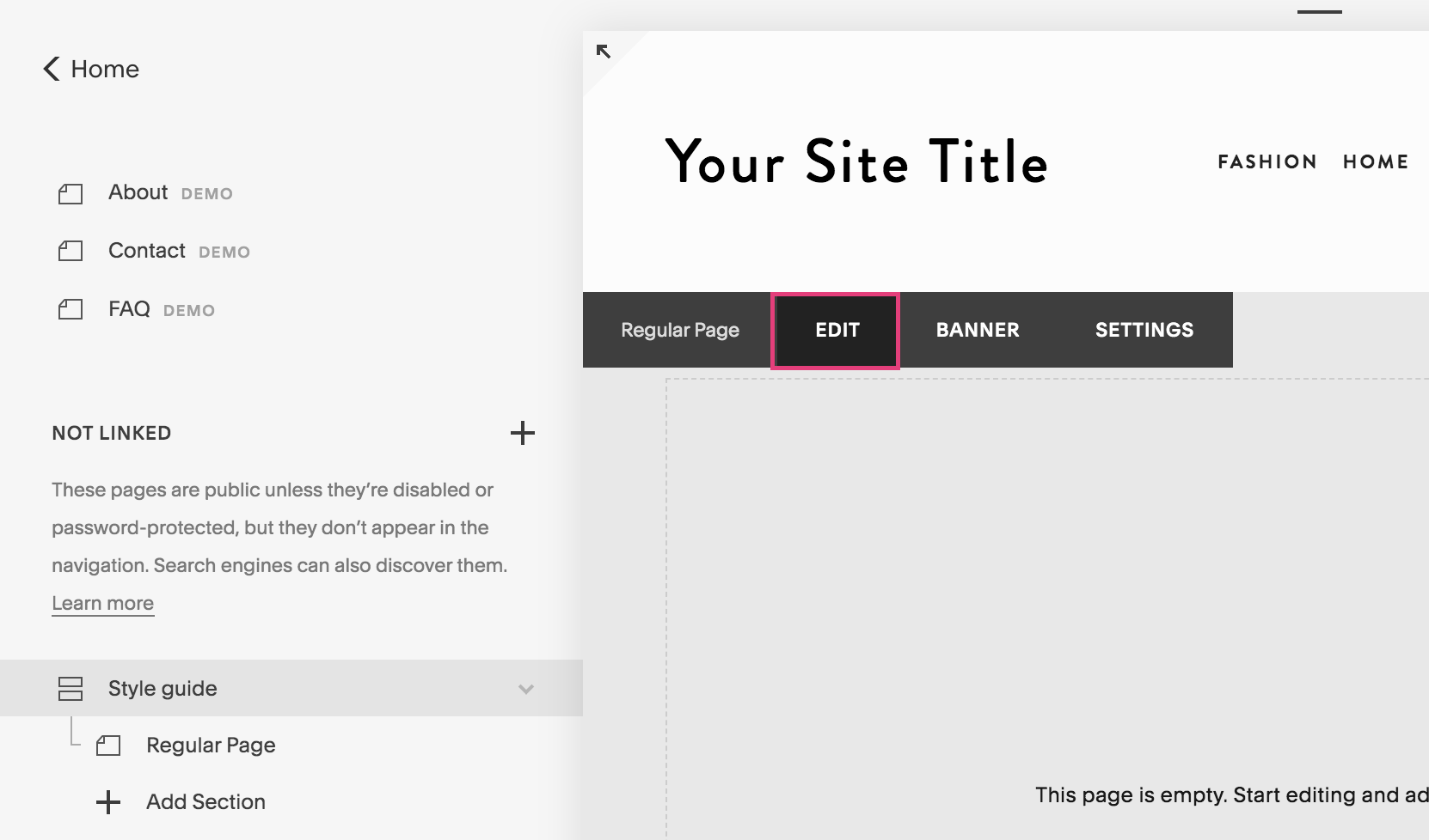
1. Add an index page to the not linked section
Under the Pages panel, scroll down to the not linked section.
Use the + icon to add an index page and name it “Style Guide.”
2. Add a regular page within the index page
Click on Add Section just below the index page.
Add a blank page.
Name it “Regular Page.”
3. Add your headings, paragraph text, text links, lines and buttons
Click on Edit at the top of the page.
Use the insert point to add a text box.
Add your Heading 1, Heading 2, Heading 3, regular text, a text link, a line, your small button, medium button, and large button each on its own line.
For the headings, you can label them exactly what they are and then where the formatting bar appears, click on “Normal” and drop down to the specific heading it is.
Click Save.
4. Duplicate the page and add an image
Click the gear icon next to “Regular Page.”
Scroll down to where you see Duplicate and click on it.
Name it “Banner Image.” It may appear outside of the index page, so you can drag it under the Regular Page.
Now click on “Style Guide” to refresh the page.
Scroll down to the “Banner Image” page section and hover towards the top until you see the black bar appear.
Click on Banner.
Drag an image in or click on the image area to upload a picture. Click Save.
Now you will see that the colors of the text, text links, line and buttons have changed and look different from the your Regular Page.
Note that the style stays the same. The only thing that changes it the color.
5. Format the text for each one and add the colors
Click back out to the main panel.
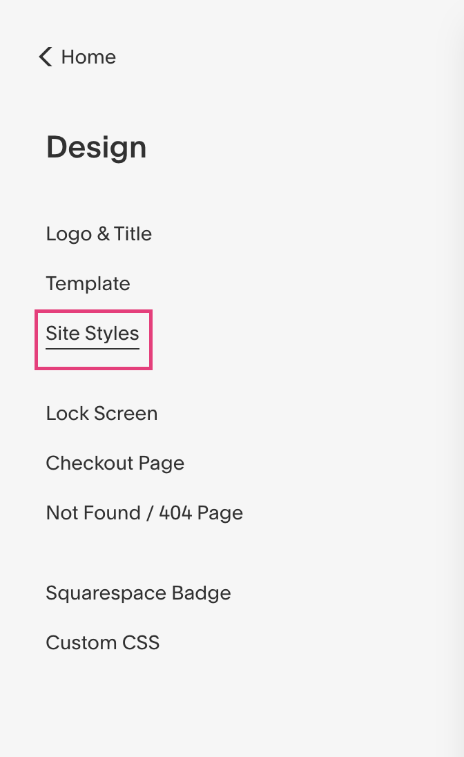
Click on Design, then Site Styles.
Note that the index page should still be in your view on the screen.
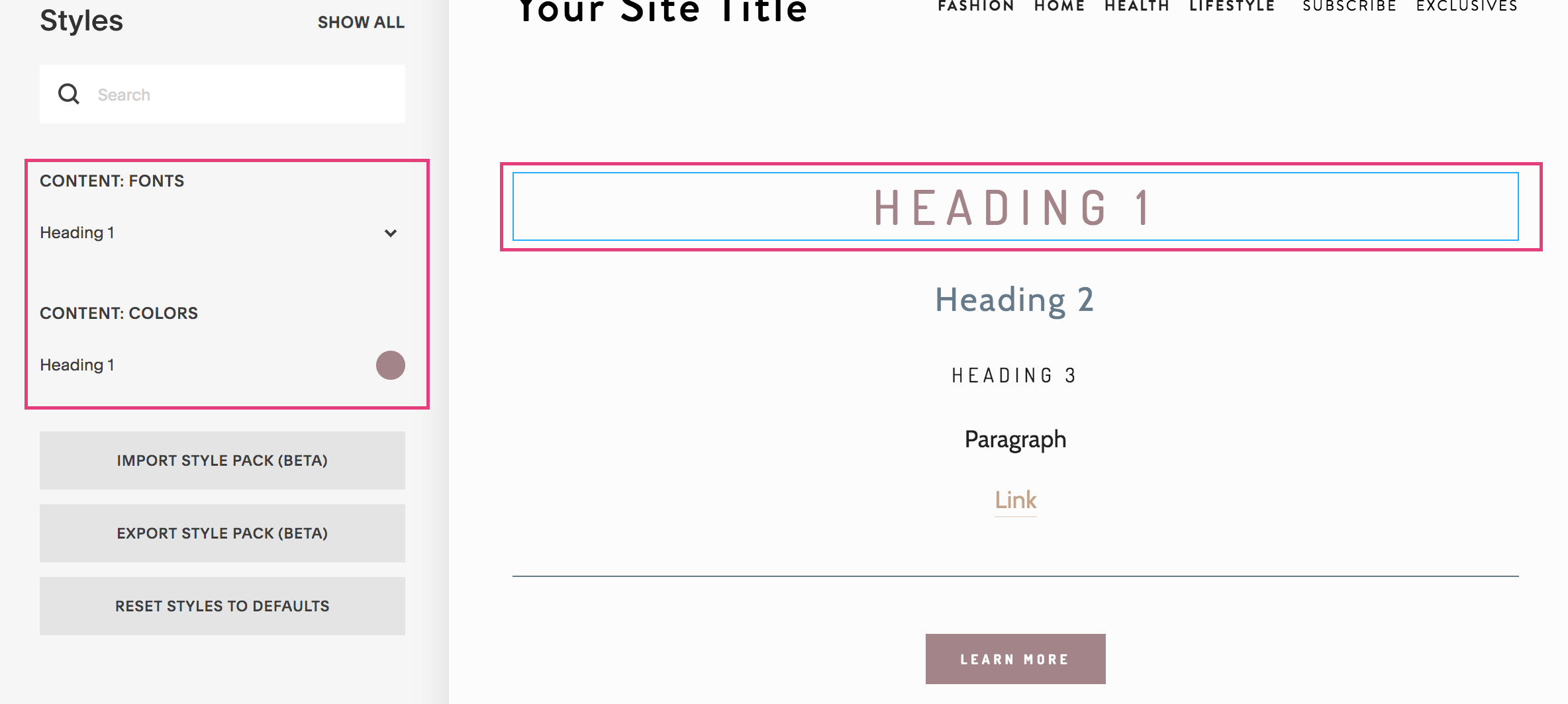
Now you can click on each element to change it’s individual settings.
With each of the headings and the paragraph text, you can change the:
font
weight
style (normal or italics)
size
letter spacing
text transformation (uppercase, lowercase, capitalize)
line height
With the colors, you can insert the hex code (the code with the # symbol).
Key things to note for your banner image text
Before you change the text - take a moment to think about how you want the text to appear over images and if your images will have overlays.
Your text needs to be easy to read, therefore it has to pop against the background. If your text blends into the background, then you will create a poor user experience and the site visitor **ahem** potential dream client will click out of your site.
For example…
Do you want dark overlays on your images? Then you will need light text.
Or do you want light overlays on your images? Then you will need dark text.
Keep in mind these best practices:
Use the same 2-3 fonts for all of the text on your site.
Sans serif are great for headings
Serif fonts are great for paragraphs
When you click on the font, you will notice the headings that break down the different types of fonts
You should have a maximum of 5 colors besides black and white.
Headings should be sized in order, meaning Heading 1 is largest and Heading 3 is smallest.
Keep paragraph text black, or at least a very dark grey.
I can tell your firsthand how much easier this step makes my life when building out websites. This way, you don’t have to try and tweak these settings as you go along.
To recap, to create a style guide in Squarespace, you want to:
Add an index page to the not-linked section
Add a regular page within the index page
Add your headings, paragraph text, text links, lines and buttons
Duplicate the page and add an image
Format the text for each one and add the colors
Have questions or comments? Drop them below!


