Sweat with Stodds: Branding
Please note that this post contains affiliate links and any sales made through such links will reward me a small commission – at no extra cost for you :)
I'm so excited to share this branding package on the blog. My former coworker, Christine, came to me because she was ready to invest in the branding for her blog and personal training business. She's commonly known as Stodds, a shortened version of her maiden name, hence the name Sweat With Stodds.
She wanted a logo and branding that was confident, fun, bright, bold, and feminine. She also mentioned wanting blue and purple shades, but no red or yellow.
Step 1: Brainstorming
After filling in the branding questionnaire, Stodds put together a brand inspiration board on Pinterest. From there, I selected a few photos to create her mood board and identify the main color themes.
Step 2: Logo Design
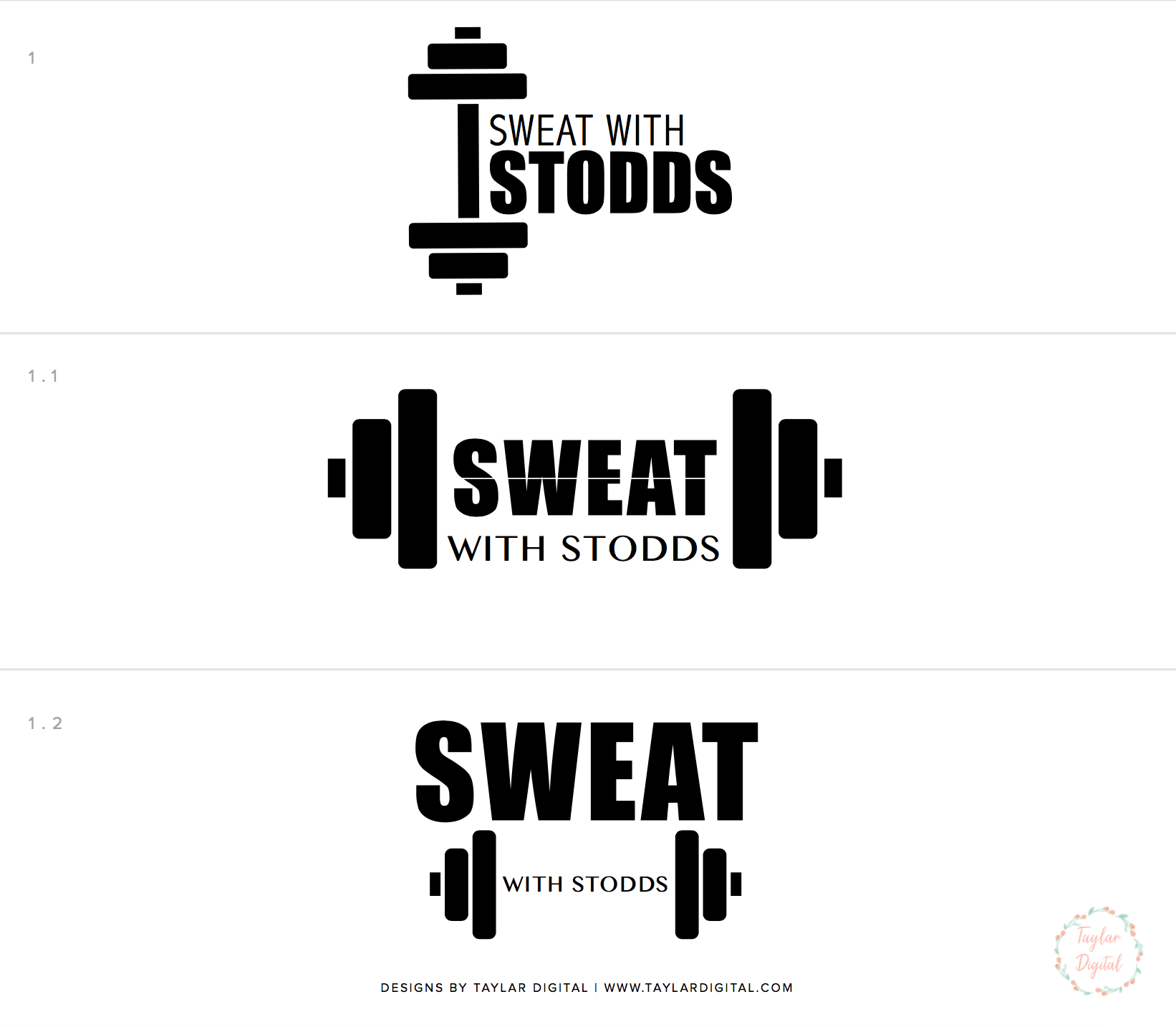
Below are some of the initial logo concepts I put together. These are first shown in black and white so that my clients can just focus on the design, not the colors associated with it.
There was a teardrop that appeared above the 2.2 logo, which is something Stodds was drawn to (I can't show it because it was a screenshot of a graphic from Creative Market that I inserted as a preview).
The second revision included different variations of the 2.2 font choices with a teardrop graphic.
After some deliberation, Stodds came back with some drawings of how she wanted to see the teardrop styled - 1) smaller teardrops around the word "sweat," 2) the teardrop to the left of the text and 3) the text placed over the teardrop. She also wanted to see different variations of raindrops than what had originally been shown to her.
She ended up choosing the one with the smaller teardrops, and then I showed her several variations with different text sizing and spacing (see below) .
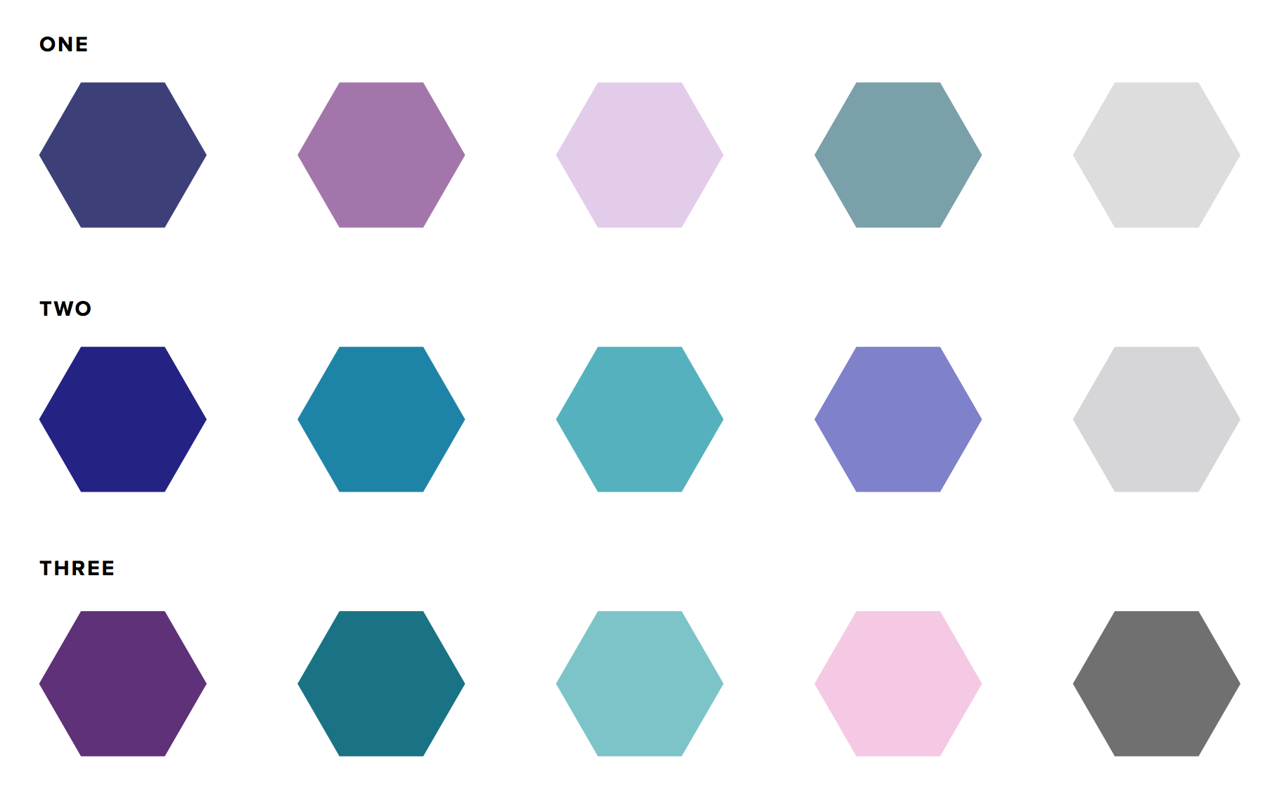
Next was choosing the color palette. I gave her 3 options to choose from based on the questionnaire and she chose the third option.
Then it's time to add color to the main logo and create the alternative logo. Below are the options I put together for Stodds.
She decided on 1.1 for the main logo and 2.3 for the alternative logo. The next step is putting together the branding style board.
Step 3: Branding Style Board
The branding style board is where the logo, logo variations, fonts and color palette are organized. I designed the graphic elements - favicon options, "buttons" for her site, and a line/divider. Stodds mentioned her love for peacocks and I was able to find textures that matched that style.
The final step is creating the style guide, which explains how and when the fonts should be used. It also includes the various color codes (CMYK, RGB, hex) so that she can keep branding consistency on any marketing materials.
Are you ready to invest in your business with professional and clean design?


