Squarespace Secondary Navigation: How to Add a Button
One of the things I love about Squarespace is that it’s super easy to add a button to your navigation. No coding is necessary.
This is done through the secondary navigation, which gives you the option to change the style.
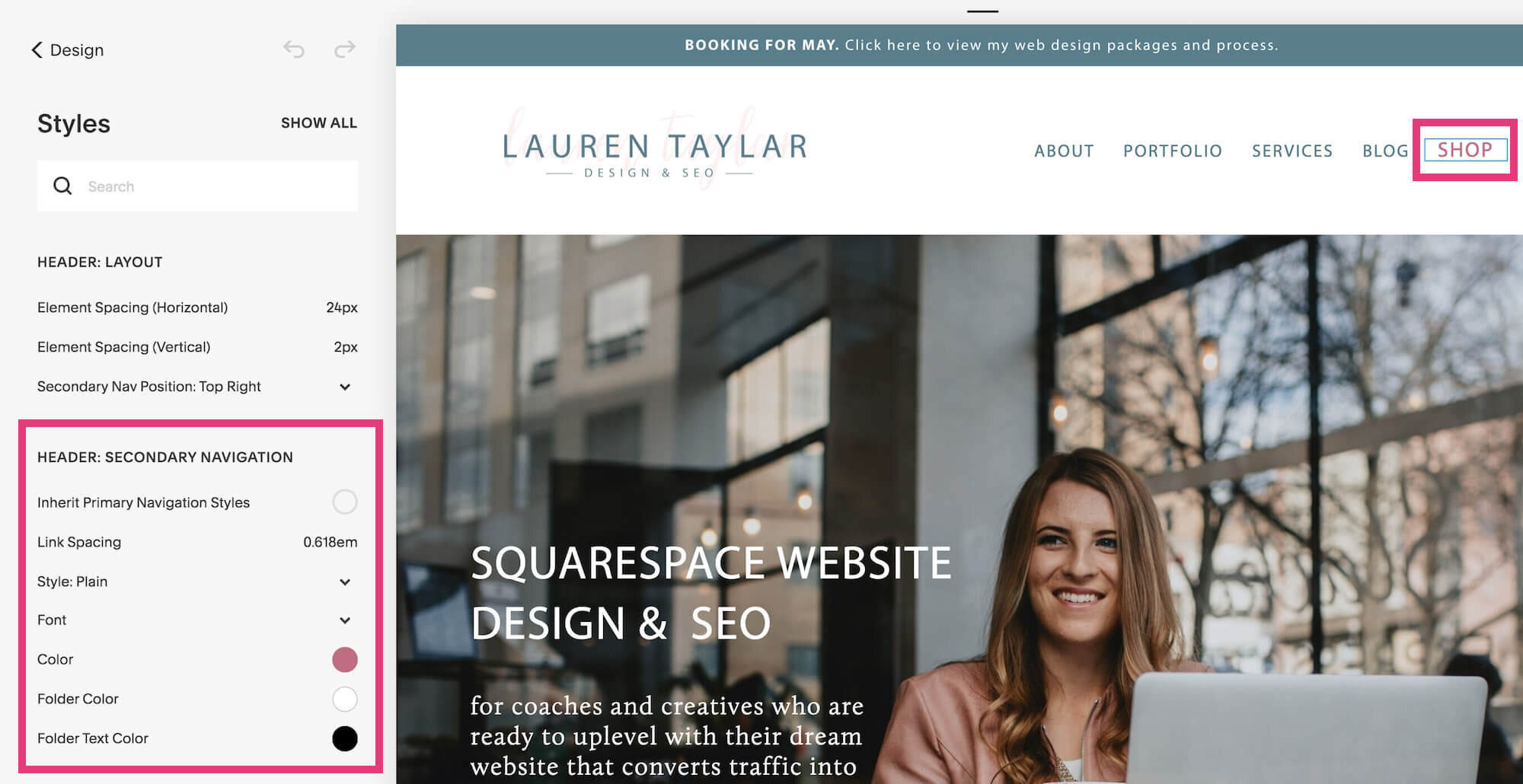
Here is an example…
Note: Not every template in Squarespace 7.0 has the secondary navigation feature. To check to see what templates do, check out this help page. I’m using the Rally template, which is part of the Brine family.
Besides just the visual “prettiness” of having a button in your top navigation, there are a few other reasons why you might want to include one.
Benefits of adding a button to the far right side of your navigation:
Stands out against the rest of the pages
Has a higher conversion rate
Your eye is naturally drawn to the right-most section of a navigation
There is quite a bit of flexibility in terms of what you can add. Here is the full list of elements you can add to your navigation:
Regular page
Index page
Gallery
Products page
Blog
Events page
Album
Cover page
Folder
Link
Now let’s dive into how you can add a button to your secondary navigation on your Squarespace website.
1. Set up your primary navigation
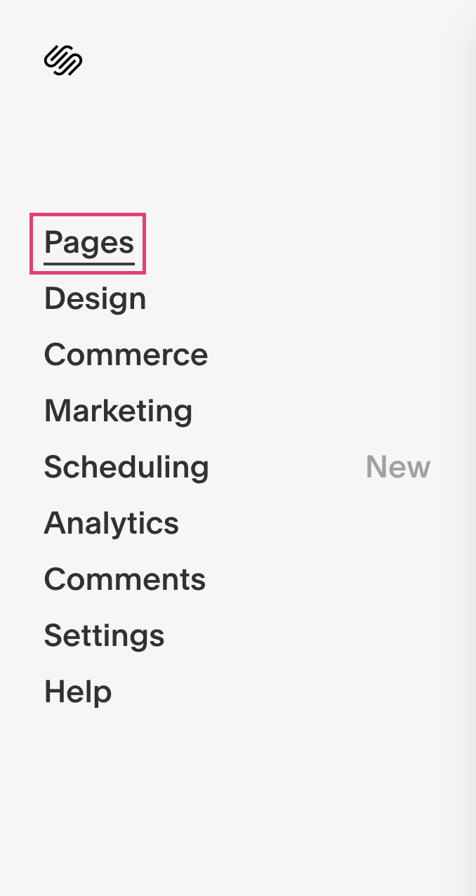
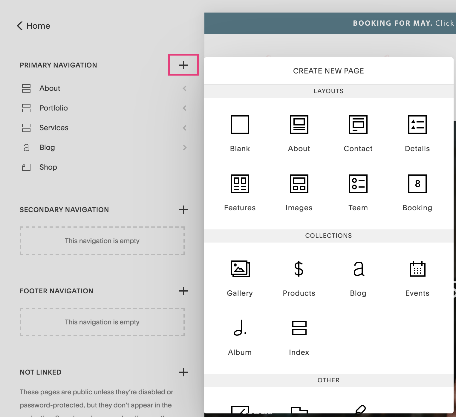
If you click on Pages from the side panel, you see primary navigation, followed by secondary navigation, footer navigation and not linked.
Your primary navigation holds the main pages that will appear at the top of your website. If you don’t already have your website set up, you’ll want to add the 4-5 most important pages here.
You can do that by clicking the + icon and adding a page name.
Once you add your pages, you can then click and drag to change the order of how they will appear in the navigation. Top to bottom pages on the side panel translate left to right in your navigation.
2. Create your secondary navigation
You can either add a new page here or simply drag the page from your top navigation. It doesn’t make a difference here.
When deciding on which page should be singled out with a button, you should choose a page that you want to draw the most attention to.
For example, sometimes clients will use “Contact” or “Shop” here depending on what their website goal is at the time.
3. Style the secondary navigation
You might notice right away that the page in the secondary navigation is not the style you want.
This where we customize it.
Return to the main panel. Click Design, then Site Styles.
Click on the page in the secondary navigation and you’ll see that the “header: secondary navigation” styling options automatically pop up.
Click on style to open the dropdown options. Choose button.
More options will appear.
Here is where you can change the:
Button shape: square, rounded, pill
Font settings
Button color
Text color
There you have it! That’s how you add a button using the secondary navigation feature inside Squarespace.
Have questions or want to see a new Squarespace feature explained? Drop it in the comments below!
Ready to ditch the DIY embarrassment and uplevel your Squarespace website so you can finally look professional, attract more aligned clients and make more sales in your business?


