5 Reasons to Use the Squarespace Rally Template
Would you believe me if I told you I’ve built all my client websites on the Squarespace Rally template? Okay, maybe a couple have been different...
But as someone who has built more than 25 Squarespace websites, I absolutely love Rally.
I feel like it’s the most flexible of the Squarespace 7.0 templates, which is why I always recommend it.
Just about any feature my clients have asked for in the pre-design phase can be done inside Rally.
Here’s 5 reasons why I love using Rally for Squarespace websites.
1. Rally is part of the Brine family, meaning it has a lot of customization
Before I go any further, I need to explain how templates inside the Squarespace 7.0 version work. At the time of writing this blog post, Squarespace has upgraded to 7.1, which is a completely new interface.
However, 7.0 templates are still available and I continue to use them for my clients because I love how they work.
Squarespace 7.0 has various template families, and each family has its own aspect of customization. Templates in the same family have similar structure, style options, and features.
It’s important to choose a template based off of what you can customize instead of the kind of business you see using a certain template. You shouldn’t scroll through the Squarespace template area until you find an aesthetic you’re looking for - this is a very common mistake in the template decision process. Meaning that if you see a website showcasing a yoga studio and you have a yoga or fitness studio, you shouldn’t assume that’s the best template for your business.
Choosing the wrong template can lead to you having to switch in the future, which is a pain and causes a lot of frustration. Switching from one template to another doesn’t always translate well, especially if they’re from different families.
Trust me...it happened to me 3 times because I didn’t do enough research.
Here are the template families:
Adirondack
Avenue
Aviator
Bedford
Brine
Farro
Five
Flatiron
Forte
Galapagos
Ishimoto
Momentum
Montauk
Native
Pacific
Skye
Supply
Tremont
Wells
Wexley
York
Rally is part of the Brine family template listed above.
Brine is known to be the best template family because it has a lot of flexibility when it comes to design and customizing your website the way you want, especially when using the Style Editor options.
I believe that the myth of Squarespace lacking any customization came from people not choosing templates correctly. You can do quite a lot with Squarespace without any code.
Hopefully this post will help break down why Rally is an amazing option for your business.
You can see more in Paige Brunton’s template comparison chart here.
2. Index pages and banner images
One of the best features of Rally is the ability to use index pages. Index pages give you the ability to stack pages on top of one another.
You may be wondering, well what’s the purpose of that?
It gives you the ability to have various sections on a page with background images.
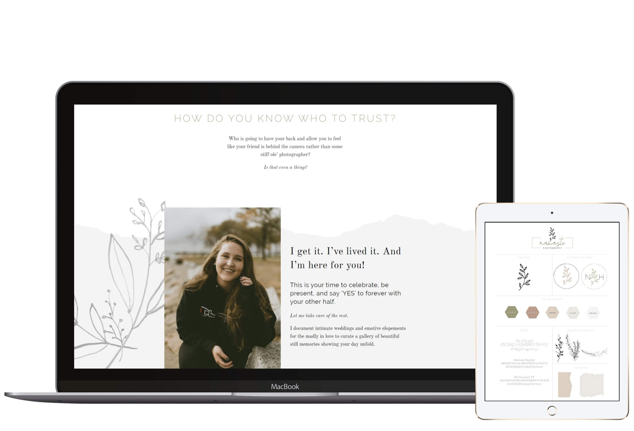
If you’ve gone to a Squarespace website and wondered how that person achieved a certain look with design elements spanning the full width of the page or coming out of the sides of the screen, those are individual banner images.
Here is an example.
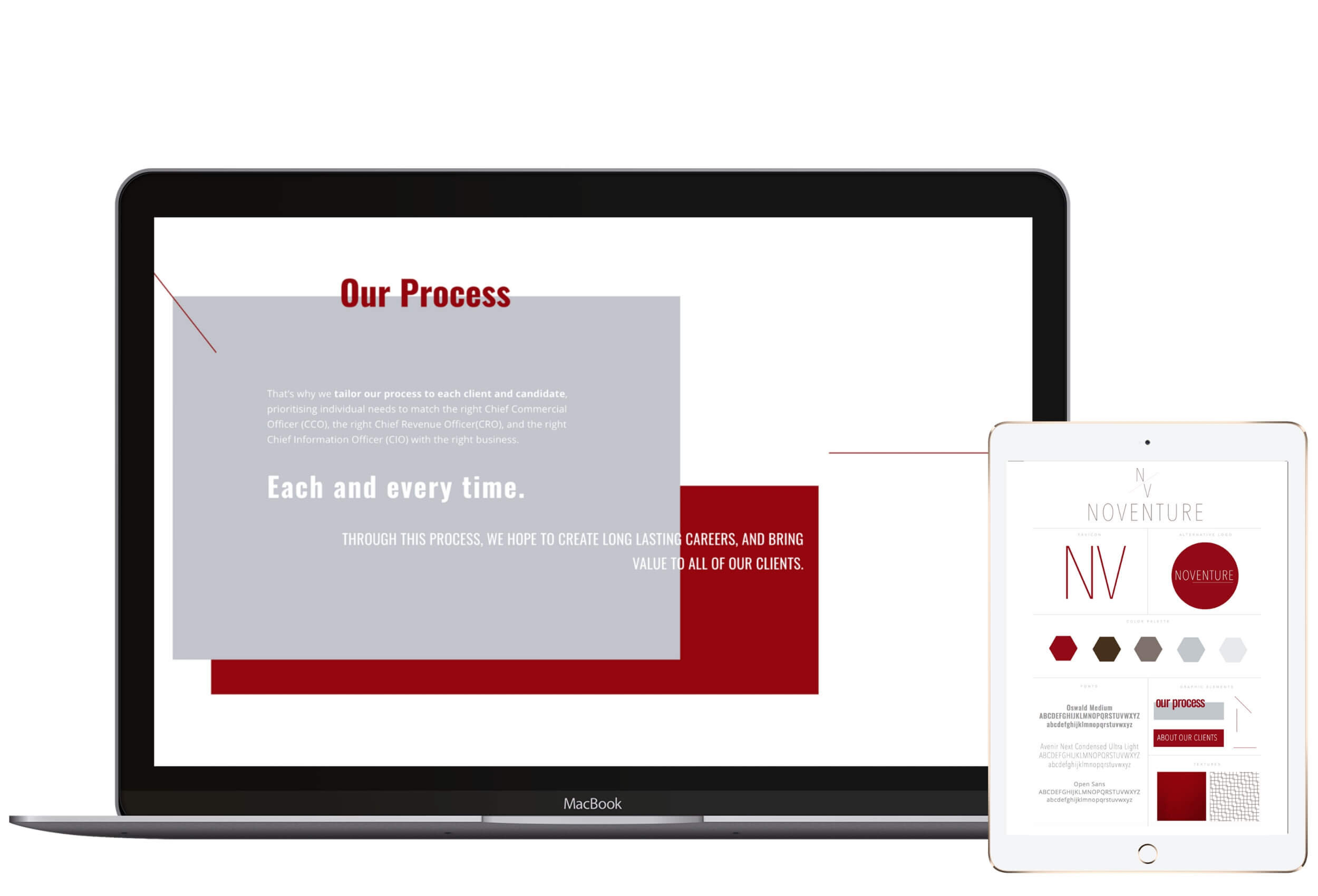
This is also how you can achieve super fun designs. I’ll use Taylor’s website below as an example. I was able to add a background image with the graphic elements that appear to be coming out of the side of the screen.
This is the power of banner images inside index pages - they don’t have to just be a solid block of color or a real image of something. You can get creative here.
Below is an example.
3. Parallax
If you’re not sure what parallax is, it’s the “melting look” of images as you scroll down your screen. It looks as though the images are moving.
It adds extra pizazz to your website if that’s a feature you like.
Unfortunately Squarespace 7.1 doesn’t allow this feature, and many of my clients love this design feature on their website.
My amazing client, Lauren of Laurilyn Farms, uses parallax on her website. You can see that here.
4. Flexible navigation
Primary navigation
When it comes to your navigation, Rally allows you to customize it various ways.
Rally has two different levels of the main navigation - top and bottom.
The top area stands on its own section. So if you want your navigation bar to be white or colored, you can position your logo and navigation here. My website is an example of this.
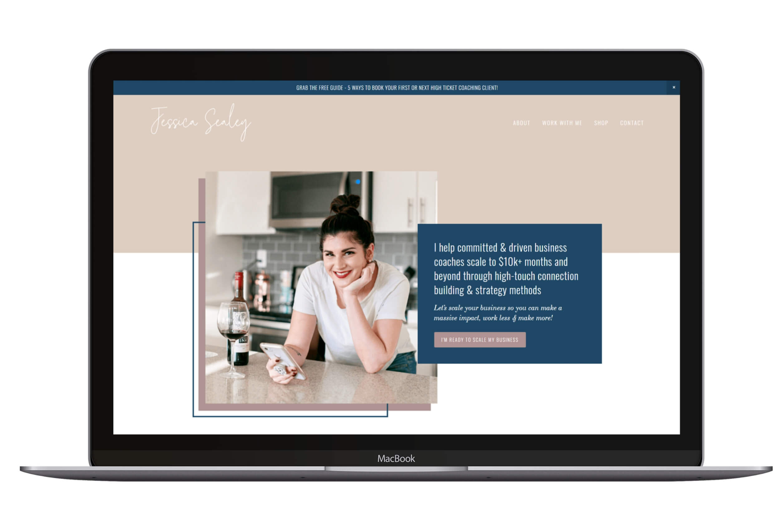
The bottom area positioning is great if you want your logo and navigation to appear on top of the main banner image.
Here is an example…
You have the ability to choose which view you’d like.
You can also choose to move it around to left, middle or center.
Secondary navigation
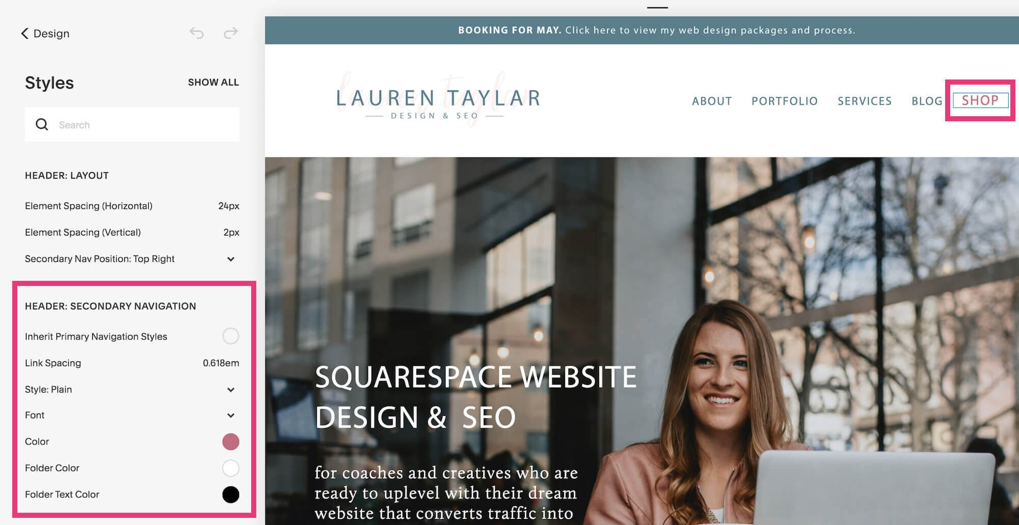
Squarespace has a secondary navigation option so you can style it differently than the rest of the main navigation.
It appears to the right of the main navigation (or can be positioned above), and this is commonly where business owners will use the box feature to make a page pop out against the other pages.
Footer navigation
But that’s not all. Rally also allows for a footer navigation at the bottom of your website.
You can either use this element or link all of your website pages in the footer. Both options work great on any website.
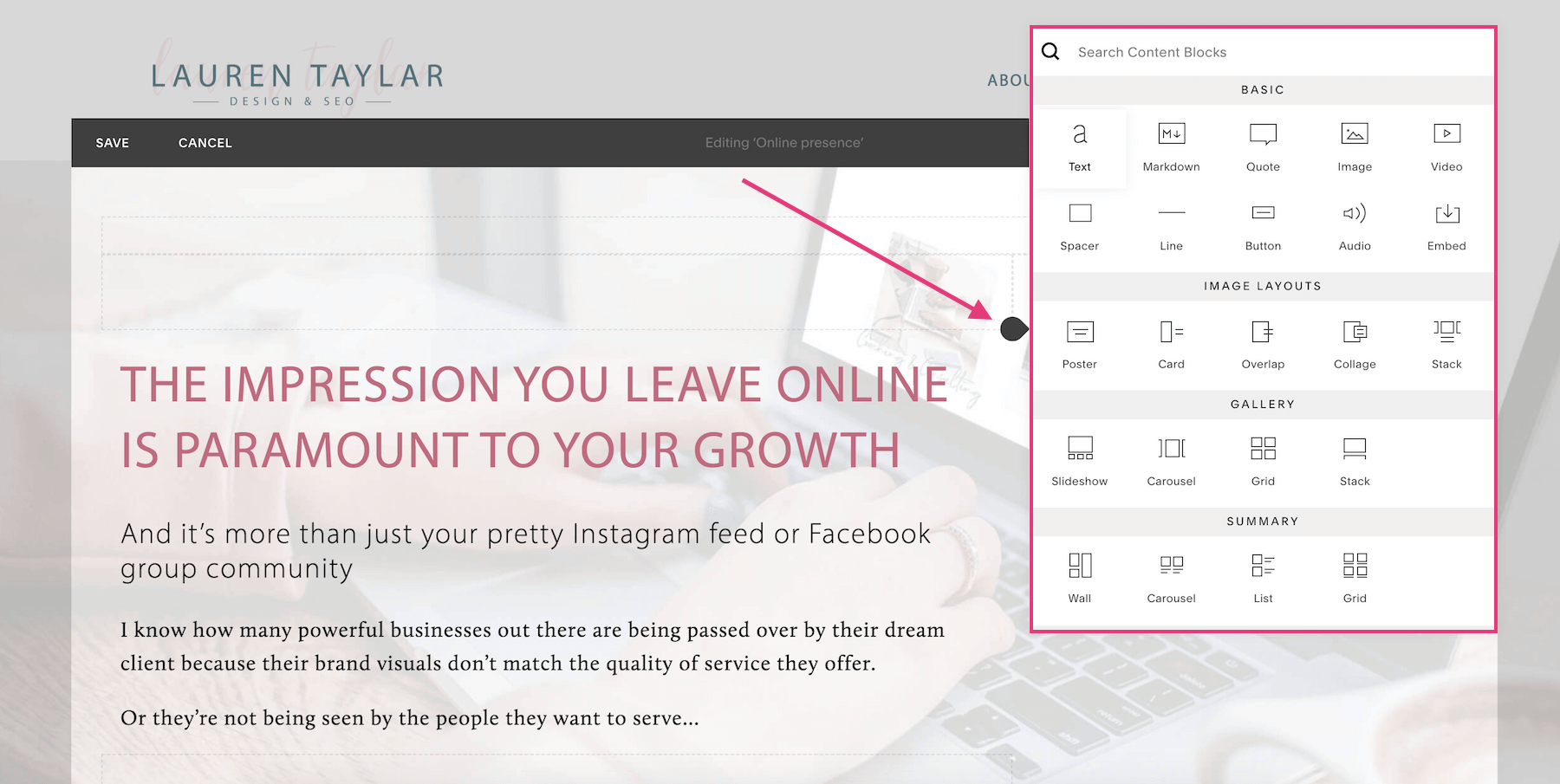
5. You can add any block over a banner image
This is by far my favorite feature, and not every Brine family template allows this.
Some templates only allow you to add text over a banner image, but with Rally you can easily add any Squarespace block:
Text
Markdown
Quote
Image
Gallery blocks
Video
Spacer
Line
Button
Audio
Code / embed
Summary block
Form
Newsletter
Map
Menu
Calendar
Appointment scheduling
Search bar
Product
And more!
Being able to add any block to a banner image allows for extra customization. This is honestly what makes Rally stand out most from other templates.
There you have it! That’s why I love the Rally template for Squarespace websites! What do you think...have I convinced you?
PS. Want to view how the Rally template can be styled? Click over to my portfolio to see! All of those websites are built on the Rally template.
Ready to ditch the DIY embarrassment and uplevel your Squarespace website so you can finally look professional, attract more aligned clients and make more sales in your business?
You might also love these Squarespace blog posts…


