How to Set Up and Style Your Squarespace Navigation
Setting up your Squarespace navigation bar isn’t a difficult task, but there’s more intention and strategy that goes behind it than you might think.
So why do you need to care about the navigation on your website?
That's because it’s one of the first things that people see on your website. And you could completely be overwhelming the site visitor when they land on your homepage.
That’s why I’m breaking down in this post the types of Squarespace pages you can include in your navigation, the different sections that make up your navigation, common styling options, and best practices you should be aware of.
What you can include in your navigation
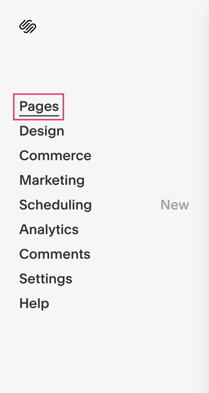
Inside your website’s dashboard, click Pages.
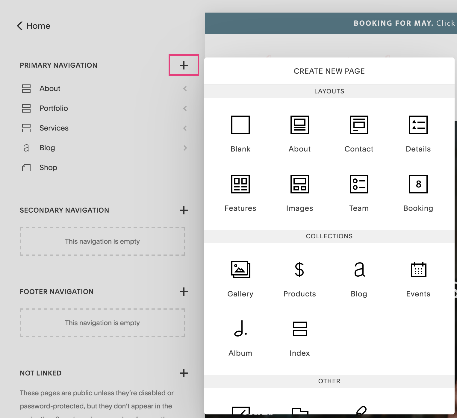
Click the plus icon next to “primary navigation.”
You’ll see that a popup with these options will appear:
Regular page
Gallery (can be used to showcase full page images)
Products or shop page
Blog
Events
Album
Index pages
Cover page (can be used as a freebie)
Folder or drop down menu (common for services / offerings)
Link to outside or external website (like a Facebook group)
These are the types of things you can add to your navigation.
Understanding the different areas of your Squarespace navigation
Inside Squarespace under Pages, you’ll notice a few different navigation sections.
Primary navigation
This is what appears at the top of your website.
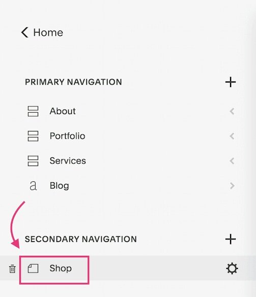
Secondary navigation
This is an extra type of navigation that also appears up top. This is perfect if you want an element of the navigation to look different than the primary navigation (ie a button style).
Note: not all Squarespace 7.0 templates have a secondary navigation feature. I use Rally, which is part of the Brine family.
Learn more: How to Add a Button to your Squarespace Secondary Navigation
I’ll explain more of how this can be used in the styling section below.
Footer navigation
These are the pages that will appear in your footer navigation at the bottom of your website.
Don’t worry about what section you add the pages under. You can easily move the pages from each section or change their order by simply clicking and dragging them.
6 ways to style your Squarespace navigation
Again, I want to preface that I’m using the Rally template inside Brine. If you’re using a different Squarespace 7.0 template, it may look different for you.
Under Design - Site Styles, you can edit the styling options for each navigation section.
You’ll find that the primary navigation, secondary navigation and footer navigation all have different options. You can simply click around to view the different options.
A rule of thumb is to keep the primary and footer navigation settings the same. Of course, the secondary navigation is meant to be a little different so it’s completely normal to have a page or two that’s different there.
Here are a few different ways to style your top navigation in Squarespace.
You can make these changes under Design - Site Styles - Header Layout (or simply click on the navigation area to make the options appear on the left).
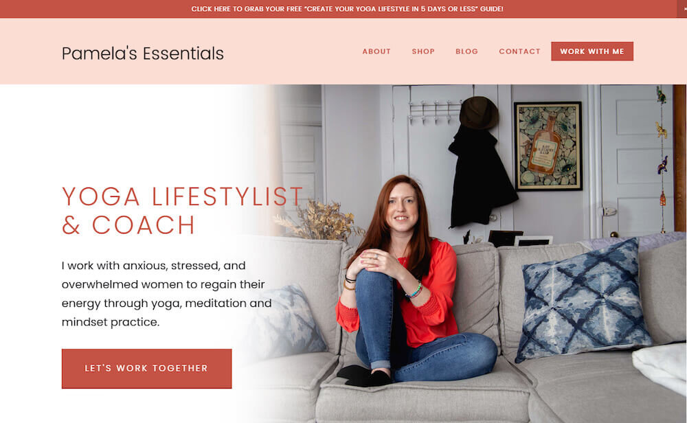
1. Logo on left and navigation on the right
This is the simple setup and most common on websites.
Settings:
Branding position: top left
Primary nav position: top right
Below is an example.
2. Logo in middle, navigation split
First you’ll want to move half of your pages to the secondary navigation area under Pages.
Settings:
Branding position: top left
Primary nav position: top right
Under Header: secondary navigation - click on “inherit Primary Navigation Styles”
Below is an example.
3. Logo in middle bottom, navigation above
Settings:
Branding position: bottom middle
Primary nav position: top middle
Below is an example.
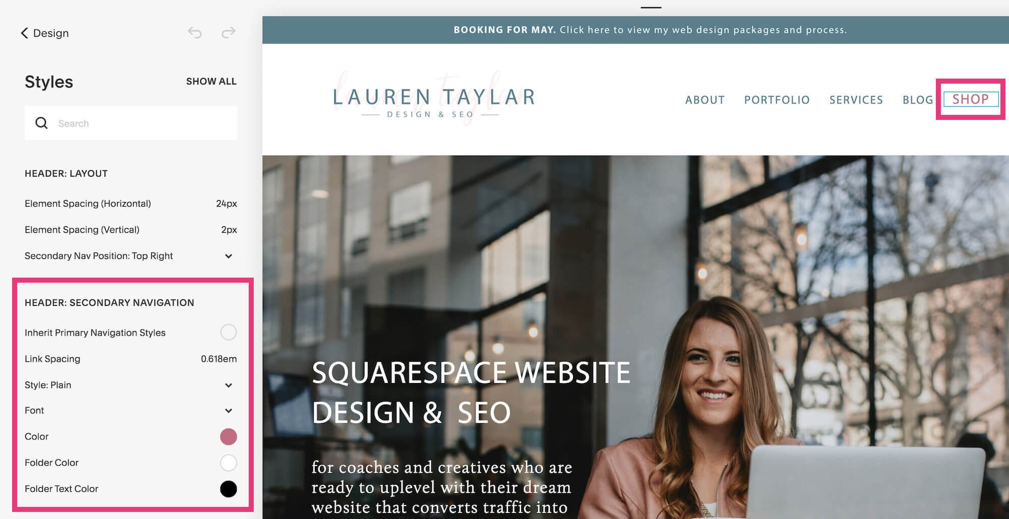
4. Logo on left, regular navigation with an accent button
This is where your secondary navigation comes into play.
First you’ll want to move one of your pages to the secondary navigation area under Pages.
Settings:
Branding position: top left
Primary nav position: top right
Under Header: secondary navigation - click on plain and change to button
More details about this step by step process can be found here.
Below is an example.
5. Logo on left, primary on bottom right, secondary on top right
First you’ll want to move the pages you want to have the button look to the secondary navigation area under Pages.
Settings:
Branding position: bottom left
Primary nav position: bottom right
Secondary nav position: top right
Under Header: secondary navigation - click on plain and change to button
6. Background or no background
Click on the navigation, and under Header: Top, you’ll see background. This is where you can change the color to make it white or a color in your color palette.
Navigation best practices
1. Make it clean and decluttered
Not every single page of your Squarespace website needs to be put in the top navigation.
I know the common thought process is…
Well why not? By including all the pages up there, someone can access everything.
The truth is that it causes analysis paralysis to site visitors
You want to limit your options to 5 pages if possible. The least amount, the better.
The pages that are in your top navigation should be the crucial pages that someone needs to read through before taking the next step to get in touch.
Common top navigation pages:
About
Services
Shop
Testimonials
Portfolio
Blog
Pages that don’t need to go in the top navigation:
Home
You might be wondering why I put Home in this list. That’s because most online business owners know that clicking the logo will take them back to the homepage so it helps minimize the clutter. An exception is if your audience is an older generation who wouldn’t understand that.
Resources
Want to promote different tools and programs you love for your business so you can increase your affiliate income? That’s great, but this info can go in the footer.
Contact
If you’re confused with this one, let me explain. As long as you’re guiding people through calls to action on your website, having this in the top navigation is not crucial. For example, from my services page I lead my clients to a call booking form. So the contact page is irrelevant unless someone stumbles on it and wants to contact me that way.
2. Minimize drop downs
This goes off my last point, but deserves it’s own spot. Because if your 5 page navigation is actually 5 menus with 4 drop down pages each, you’re creating a lot of overwhelm.
Unless it’s super strategic, like a real estate website with a drop down of common towns they serve, then try to leave it off. Basically, be careful with the number of drop down options.
3. Exclude social media profiles
Unless you’re a personal brand, like a lifestyle blogger or YouTuber, your social media profiles won’t matter and only take up more space and overwhelm.
Chances are that you’re an entrepreneur offering services through your website. Therefore, your goal is to drive people to your website and sign up for your email list.
You can put your social media profiles (even your Instagram feed) in your footer.
4. Write strong and clear page titles
Make sure that the title of the pages in the navigation are super clear.
This shouldn't be a guessing game, and it’s not a place to get creative or “be original.” Someone should know literally what they are about to click on before they actually get through to that page.
For example, you don’t want to name your blog “biz tips” or “musings.” Blog is universally known, so it's best to keep that title.
Another example I see is for business coaches - they’ll have the names of their programs as the drop down.
Let’s say you’re a business coach and your program is “Skyrocket to Your First $10K.”
But the problem is that no one knows what that is…
Is it a 6 month 1:1 program?
Is it a 3 month group coaching program?
Is it a membership site?
Is it a 90 minute intensive?
See how the confusion can creep in quickly? That’s why it's important to be straightforward and clear about what the page is about.
Here’s an example of how it could look. This provides much more clarity because someone knows the container. The name is more important to have on the sales page than on a website dropdown menu.
These are the two main points that I want to make when it comes to establishing your website navigation. You want to simplify it and make those page titles as easy to understand as possible. That is really going to make an impact more than being creative.
I hope you found this post on creating and styling your Squarespace navigation bar was super helpful! Feel free to drop any questions below!
Ready to ditch the DIY embarrassment and uplevel your Squarespace website so you can finally look professional, attract more aligned clients and make more sales in your business?
You might also love these Squarespace blog posts…


