NoVenture: Branding, Social Media + Squarespace Website Design
I first met Lucy from NoVenture on PeoplePerHour, where I helped her with her new company’s branding and social media design. Then we decided to continue working together and the second time around, I designed the website.
This was such a fun project for me because I love seeing a company with no branding or social media presence at first and then look back after all the work has been done. I’m so grateful to bring the brand identity of a company to life and be part of the transformation.
So a little bit about the company…NoVenture is an executive search company that works with organizations globally to source talent. The company places high importance on culture fit, so Lucy takes the time to really understand the organizations she works with to ensure she finds the right candidate.
STEP 1: LOGO DESIGN
In the initial design questionnaire, Lucy said she wanted the branding to convey these emotions: energized, professional, and new approach. She also wanted the branding to make a statement in a refined way and asked that it be sophisticated and memorable.
As for colors, she wanted to stay away from blue. She wanted it to feel natural and organic in nature and was drawn to steel, brown, and dark green.
With that information, here were the initial logo designs and color palette choices.
Lucy decided on option 1 for the logo and for the color palette, we combined the red and browns from 2 with the silvers from palette 3.
Once those were finalized, I created different variations of the main logo in color, as well as the favicon.
For the main logo, Lucy chose 1.1 with the brown text and red accent. For the favicon, she chose option 2.
STEP 2: BRANDING STYLE BOARD
The next step is bringing all the design elements of a brand together. From the initial designs, I put together the branding style board. Avenir was used in the logo, so we paired it with Oswald to add a bold statement and Open Sans for paragraphs of text.
STEP 3: SOCIAL MEDIA PROFILE SETUP/BRANDING
Next was setting up and branding the social media profiles. These were some of banner images that were originally created.


No social media pages existed yet for NoVenture, so I set up the Facebook and LinkedIn pages.
STEP 4: WEBSITE DESIGN
The last step was setting up the website! I designed the following pages besides the homepage:
Team
Clients
Candidates
Contact
Blog
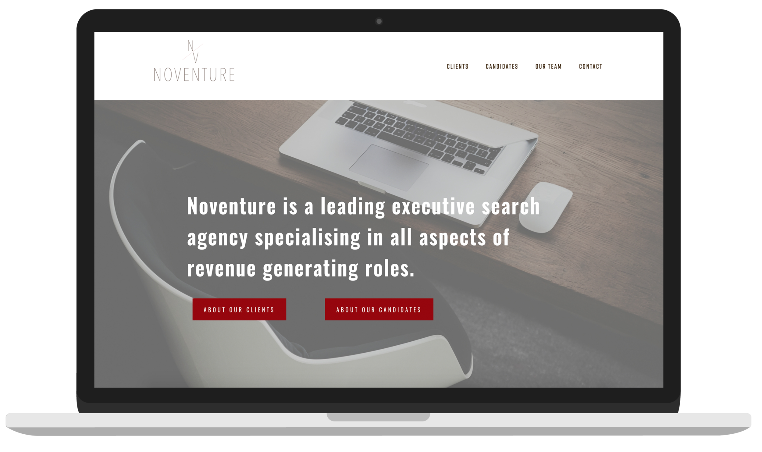
We infused many photos that represented the types of people that NoVenture was intending to attract and used the red color to help certain elements of the website stand out. I incorporated unique design elements to give the website the minimalistic feel that Lucy was looking for.
Below is a screenshot of the homepage.
LET'S WORK TOGETHER!
Whether you're looking for a website redesign or starting a new business, I'll work together with you to produce a website that speaks to you and your audience.
Here’s what Lucy had to say about working together…
“Everything about working with Lauren was great. Her guidance has been delicate at the same time layered with a professional understanding that surpasses other freelancers. She have given us a lot of time and patience, taking into consideration our evolving taste through this process. Lauren took the time to understand our needs thoroughly and guide us as necessary.”


